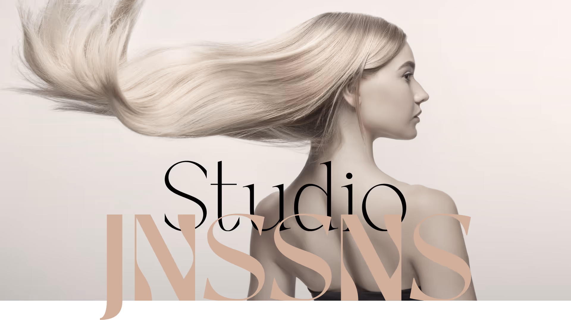
Studio JNSSNS is a new nail and hair studio that wanted an identity reflecting the precision, calm, and elegance they bring to their clients. The goal was to create a refined visual language that communicates trust and sophistication while feeling personal and inviting.
Turning craftsmanship into a visual language
The challenge was to merge technical detail with human warmth — a brand that feels as tactile and graceful as the work it represents.
We needed to translate beauty care into form, movement, and color — subtle yet distinctive.
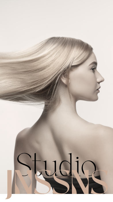
Beauty in motion — where elegance meets care, and every detail feels calm, confident, and crafted by hand.

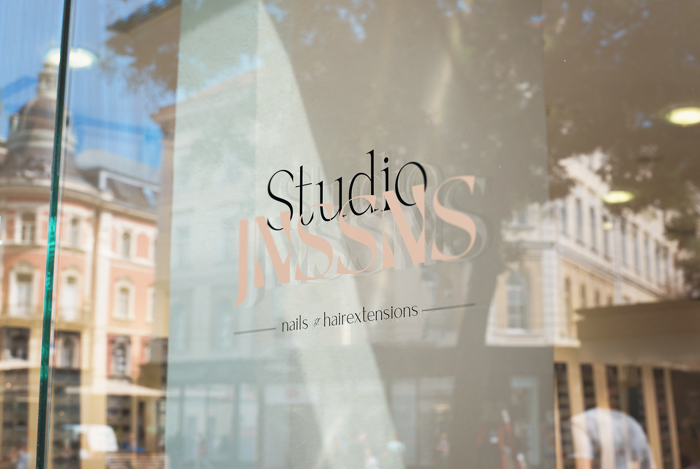
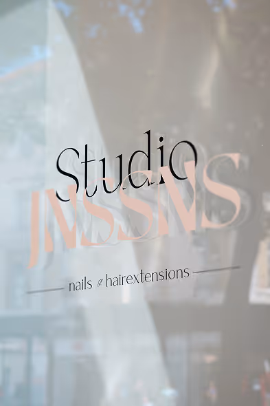
The logo subtly integrates the form of fingers into its composition, symbolizing human touch, detail, and craftsmanship. The flowing curves of the letterforms mirror the elegant movement of hair, embodying health and vitality. In the background, a gentle wave pattern adds depth and fluidity — inspired by the natural motion of shiny, healthy hair.
These organic shapes reinforce the sense of care, calm, and attention to detail that define the studio’s philosophy.
The logo integrates finger-like curves that represent touch and craftsmanship, supported by a wave pattern symbolizing softness and flow.
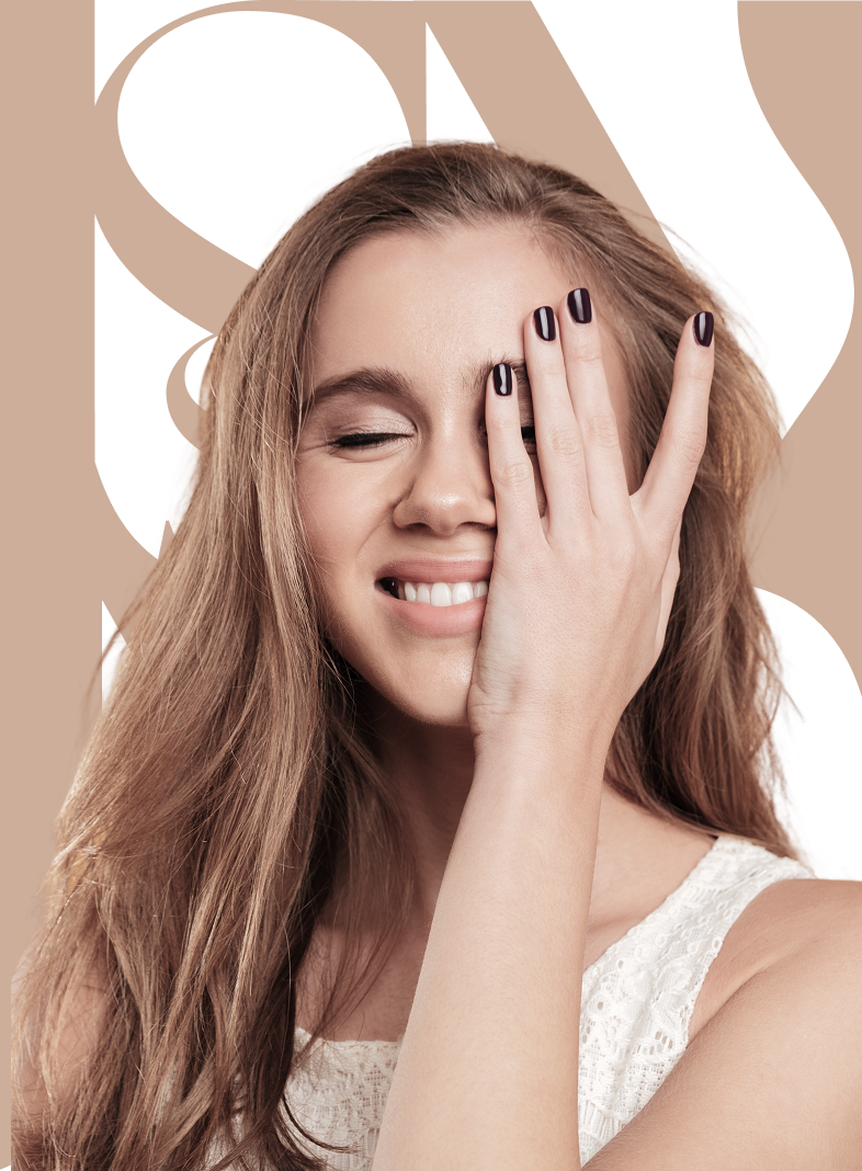
Typography blends the structure of Vasion with the warmth of Montserrat, while a palette of beige, brown, and purple evokes confidence and femininity.
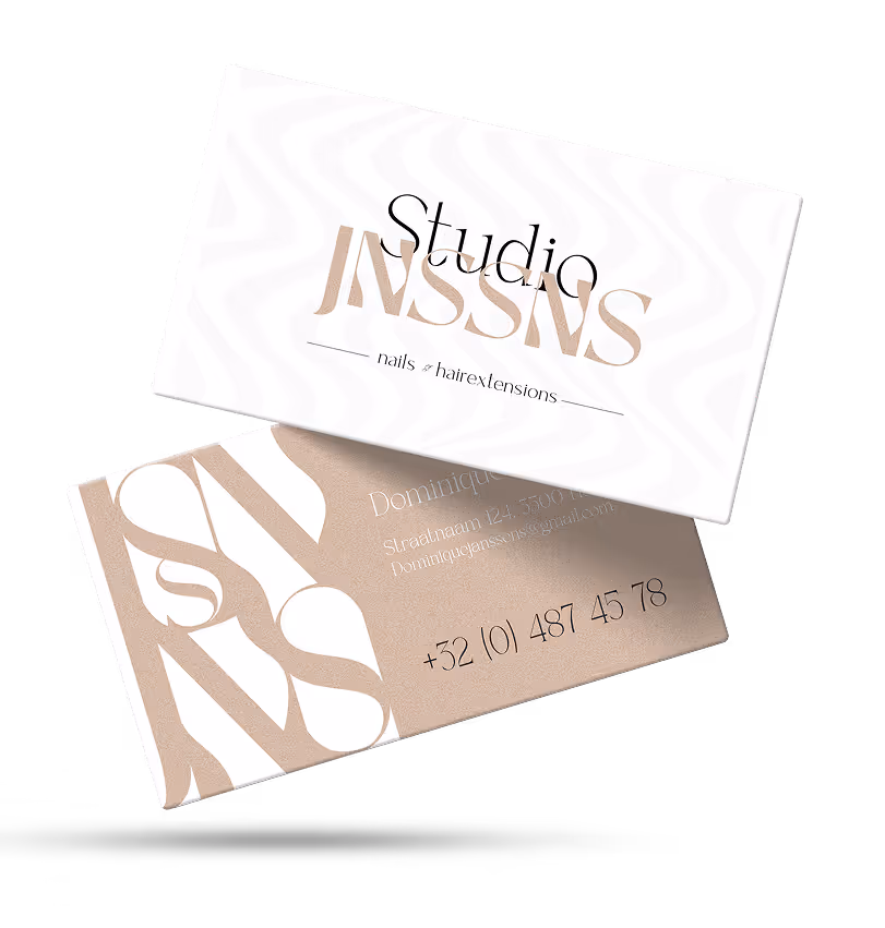
From stationery to storefront, the branding extends seamlessly across every touchpoint. The consistent use of color, typography, and texture ensures that the identity feels cohesive and trustworthy, both online and offline. It’s a brand presence that reflects care, quality, and confidence — the very foundation of Studio Janssens.
From stationery to signage, every touchpoint feels unified and intentional.
Studio JNSSNS now embodies a visual identity that’s refined, trustworthy, and effortlessly timeless — a calm expression of beauty and care.
to some of the most common questions about my work, process, and approach.
No long reads — just clear insights to help you understand how I design, create, and collaborate.

I mainly work on web design, UX/UI, graphic design, and social content. Whether it’s a full rebrand, a new website, or designing branded visuals, I make sure every project strengthens the brand and adds real value.
I follow my 4-step approach: What, Why, How, When. This keeps every project structured and clear. We start by defining the goals, dig into the purpose, shape the strategy and planning, and then deliver step by step.
It depends on the scope. Smaller projects like a logo or business cards can take a few weeks. Larger projects such as a full website or rebrand usually take a few months. I always set clear deadlines and milestones upfront.
Absolutely! I love helping emerging brands and small businesses grow with fresh, scalable design solutions that fit their budget and goals.
I test and optimize using methods like usability testing and A/B testing. That way, design choices aren’t just visually appealing — they’re also proven to be effective.
Yes! I create branded visuals and templates that make your social channels look consistent and professional. While I don’t always handle ongoing management, I’ll deliver everything you need to keep your feeds looking fresh.I test and optimize using methods like usability testing and A/B testing. That way, design choices aren’t just visually appealing — they’re also proven to be effective.
%20Medium.avif)
Open
